Making Graphs using ggplot2 in R:
The base package in R allow nice graphs to be drawn but more advanced packages allow better control and still nicer graphs to be created. Two packages are mainly used lattice and ggplot2, I will here present to you the basics of ggplot2 and the way it works.
The best way to understand the ggplot way of functionning is in this:
“ggplot2 is designed to work in a layered fashion, starting with a layer showing the raw data then adding layers of annotation and statistical summaries. [..]” H.Wickham, ggplot2, Use R
More on the different components of the grammar of graphics
The most sensitive way to work with ggplot is to creat a basic object and then add layer and complexity to it as we go:
#load ggplot2
install.packages(“ggplot2”)
library(ggplot2)
#load the data of fuel comsumption of cars
data(mtcars)
head(mtcars)
#plotting mpg (miles per gallon) and wt (weight)
q<-ggplot(data=mtcars,aes(x=mpg,y=wt)) #store the basics informations into an object “q”
#then add layers, basic scatterplot
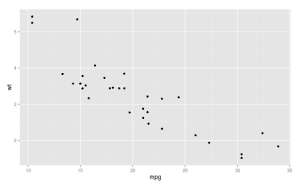
q+geom_point()
The per default layout of the ggplot automatically set the backgroung to grey and add x and y axis labels, the axis title are the same as the variable names used.
Everything can be changed and customize in this graph, let’s start with the axis and main title.
#change x and y axis title and main title using the layer labs
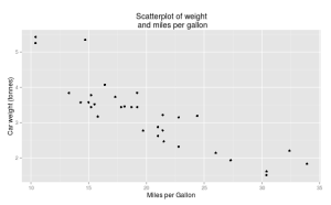
q+geom_point()+labs(title=”Scatterplot of weight and miles per gallon”,x=”Miles per Gallon”,y=”Car weight (tonnes)”)
#if we long title we can set the break line using “\n”
q+geom_point()+labs(title=”Scatterplot of weight\n and miles per gallon”,x=”Miles per Gallon”,y=”Car weight (tonnes)”)
Now if we wanted to see the effect of another variables and vary the size, shape, color of this variable here is what to do:
#if the variable is continuous
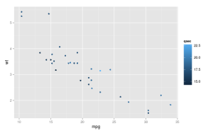
q+geom_point(aes(color=qsec))
#colors are default ones, we can set them using the “scale_colour_gradient” command and also set the legend title
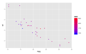
q+geom_point(aes(color=qsec))
+scale_colour_gradient(low=”blue”,high=”red”,name=QSEC)
#in R we can access all available colors using “colors()”, then we can call them using their numbers
q+geom_point(aes(color=qsec))+scale_colour_gradient(low=colors()[260],high=colors()[562])
#if the variable is categorical
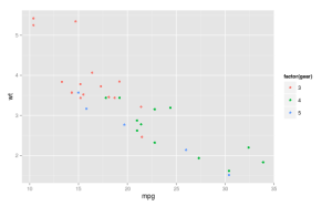
q+geom_point(aes(color=factor(gear)))
#setting the colors and the legend title
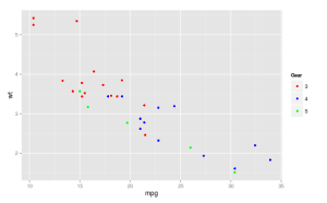
q+geom_point(aes(color=factor(gear)))+
scale_color_manual(values=c(“red”,”blue”,”green”),name=”Gear”)
#then when there are less than 6 categories we can use “shape” to differentiate between the different class of the gear variable
q+geom_point(aes(shape=factor(gear)))
Now I will present a few other possibilities in ggplot like making boxplots, histogramms, barplot, adding regression line, all the stuff that we do very often:
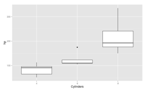
#Simple boxplots of the distribution of values of Horse Power depending on the number of cylinders
ggplot(mtcars,aes(x=factor(cyl),y=hp))+geom_boxplot()+labs(x=”Cylinders”)
#Histogramm of the weight variable, binwidth sets the break values, fill the colour filling the bars and colour the outlying colour
ggplot(mtcars,aes(x=wt))+geom_histogram(binwidth=.1,fill=”white”,colour=”black”)
#Barplot with two different format
ggplot(mtcars,aes(x=factor(cyl),fill=gear))+geom_bar(position=”dodge”)
ggplot(mtcars,aes(x=factor(cyl),fill=gear))+geom_bar(position=”stack”)
#Adding a regression line to the graph
ggplot(mtcars,aes(x=mpg,y=wt))+geom_point(aes(col=factor(gear)))+stat_smooth(method=”lm”)
#plot one regression line per group of gear
ggplot(mtcars,aes(x=mpg,y=wt))+geom_point(aes(col=factor(gear)))+stat_smooth(method=”lm”,aes(group=gear))
#separate each group in a different window
ggplot(mtcars,aes(x=mpg,y=wt,col=factor(gear)))+geom_point()+stat_smooth(method=”lm”,aes(group=gear))+facet_grid(.~gear)
It is of course possible to play around with all these functions for example in the facet.grid if we put the variable first then the tile and the point, the different windows will be horizontal instead of vertical.
A last point concerning this introduction to ggplot2 is the “%+%” function which allows you to update the content of a previously saved graph:
#using the update function
p<-ggplot(mtcars,aes(x=mpg,y=wt,col=factor(gear)))+geom_point()+stat_smooth(method=”lm”,aes(group=gear))+facet_grid(.~gear)
p %+% geom_point(shape=2) I hope this short tutorial gave you the feeling that ggplot can really help you making nice graphs using R. Next will come more advanced stuff like setting theme elements or using ggplot in maps.


Leave a Comment