
Introduction to point pattern analysis for ecologists
Point pattern analysis is a set of techniques to analyze spatial point data. In ecology this type of analysis may arise in several context but make specific assumptions regarding the ways the data were generated, so let’s first see what type of ecological data may or may not be relevant for point pattern analysis.
What data for point pattern analysis?
The most important assumptions of point pattern analysis is that both the number and the location of the points need to be random. In addition, we need to know the area that was sampled (the so-called window). Examples where point pattern analysis is relevant:
-
Tree position in a forest plot
-
Ant nests in a grassland patch
Examples not suited for point pattern analysis:
-
Community composition at a priori defined subplots forming a regular grid within a larger plot
-
The position of fixed number of bird’s nests is recorded within a given area
Examples that may or may not be suited to point pattern analysis:
-
Radio-tracking data of animal movements (see the numerous techniques available for this specific type of data)
-
Tree position in a forest plot is mapped every year forming a replicated point pattern (see specific chapter in the spatstat book)
Point pattern in R
The spatstat package provide a large number of functions and classes to work with point pattern data. I will use an example dataset throughout to show some of the (numerous) capacities of this package. This dataset consist of the location of plant and ant nests within a coastal dune system in western Europe. The dataset was collected by B. Sercu and J. Goldberg plus UGent students, thanks to them for allowing me to use their dataset. You can download the data from this link.
Creating a point pattern from existing data
#load the libraries
library(spatstat)
library(tidyverse)


#load the dataset
dat <- read.table("data/Dataset mieren af.csv",sep=";",head=TRUE)
#put the coords in meters
dat$X <- dat$X/100
dat$Y <- dat$Y/100

#creating the point pattern
(all_pp <- ppp(dat[,"X"],dat[,"Y"],owin(c(0,15),c(0,10))))
class(all_pp)
plot(all_pp)
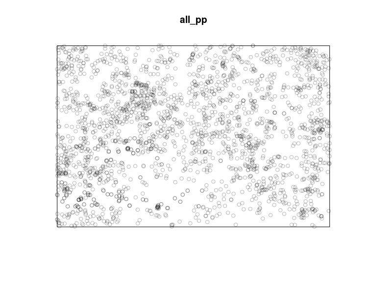
The spatstat package use a special class (the “ppp” class) to deal with point pattern. To create ppp objects we need to use the ppp function, it requires at least three arguments: (i) the x coordinates, (ii) the y coordinates and (iii) the window or the area over which we have recorded the point pattern. For this last argument we can use the owin _function to create a window object that will be used by the _ppp function. The owin function requires two arguments: (i) the range of x coordinates and (ii) the range of y coordinates.
Data manipulation of point pattern objects
#a first manipulation would be to add information to each points
#the so-called marks, in this example we could add
#the species names
marks(all_pp) <- dat$Soort

#a second manipulation could be to remove any duplicated points
all_pp <- unique(all_pp)

#then add the coordinate unit
unitname(all_pp) <- c("meter","meter")
summary(all_pp)

#we could subset the point pattern using the marks
ant_pp <- subset(all_pp,marks=="Tetramorium_caespitum")
#in that case we do not need the marks any more
ant_pp <- unmark(ant_pp)
The concept of marks is a pretty important one so I’ll spend some extra words on it. Marks can be numeric or factor vector of the same length as the point pattern, these are extra informations that were collected for each points. In this example this is the species names of plants and ants recorded, but this could also be the height of the trees or the number of eggs in bird nests. The marks will automatically be used when plotting the point pattern, try “plot(all_pp)” for instance. Note that you can also pass data frame as marks to have multivariate marks.
A second cool set of manipulation is based on the window, basically one can subset a point pattern to specific windows:
w <- hexagon(centre=c(5,5))
plot(ant_pp[w])
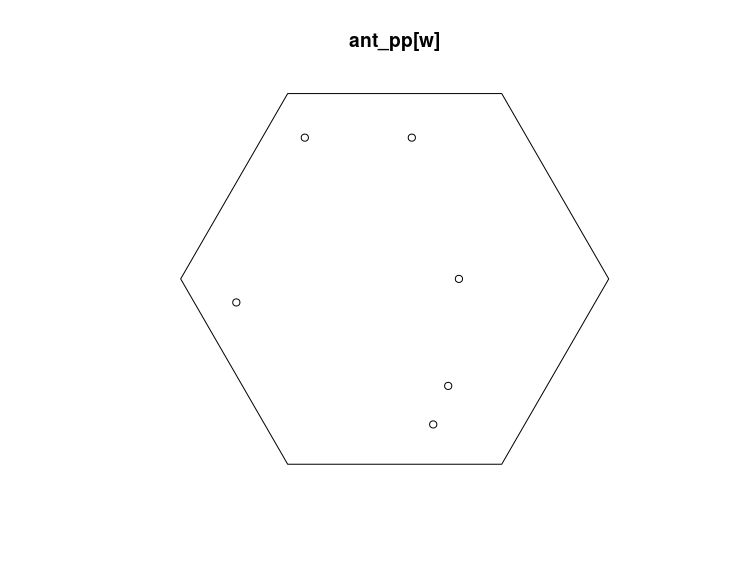
See ?owin for the many ways available to create windows.
A final manipulation that I’d like to mention now is the split.ppp function, can you guess what it is doing?
#split based on the species names
split_pp <- split(all_pp)
class(split_pp)
as.matrix(lapply(split_pp,npoints),ncol=1)
#one could also use: by(all_pp,marks(all_pp),npoints)

#split based on a window
split_ant_pp <- split(ant_pp,f=w)
summary(split_ant_pp)
I just scratched here the many functionalities that are implemented in the spatstat packages to manipulate point pattern, have a look at the help pages, vignettes and online forum to help you out in this critical step.
Exploratory analysis of point patterns
This is a very important step in any point pattern analysis, this step can help you: (i) explore the intensity, and (ii) see if the point pattern deviates from random expectations.
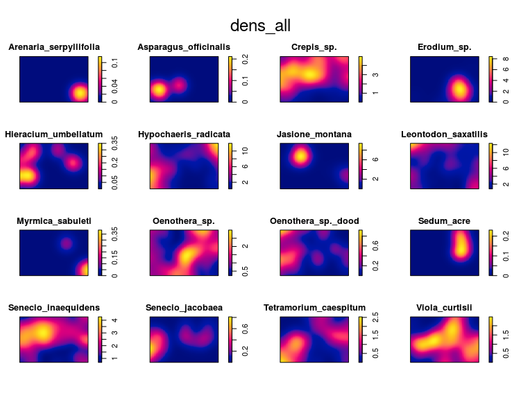
We can easily derive an estimation of the density (or intensity) of the point pattern using the density function:
dens_all <- density(split_pp)
plot(dens_all)
The first important thing is to find out if the point pattern was generated by one intensity function, in that case the point pattern is homogeneous, or if the point pattern was generated by several intensity functions, in that case the point pattern is inhomogeneous. This is an important first step in any analysis of point pattern as most functions and models assume homogeneity by default. I will show here two ways to infer the homogeneity of a point pattern: (i) simulation and (ii) quadrat count
The first approach consist in simulating completely spatially random point patterns based on the average intensity in the observed point pattern. If the density estimates of the observed and simulated point patterns are similar then we have evidence that the point pattern is homogeneous.
#compare the observed density to randomly simulated ones
#based on the intensity

#select a random position for the observed data in the figure
pos <- sample(1:16,1)
#simulate 15 CSR point pattern
simp <- rpoispp(lambda = intensity(ant_pp),
                win = Window(ant_pp),nsim=15)
#replace the simulated set at the pos'th position by
#the observed dataset
tmp <- simp[[pos]]
simp[[pos]] <- ant_pp
simp[[16]] <- tmp
names(simp)[16] <- "Simulation 16"
#compute density estimates
densp <- density(simp)
#plot, can you detect which one was the observed dataset?
par(mfrow=c(4,4),mar=c(0,0,4,4))
plot(as.listof(densp),zlim=range(unlist(lapply(densp,range))))
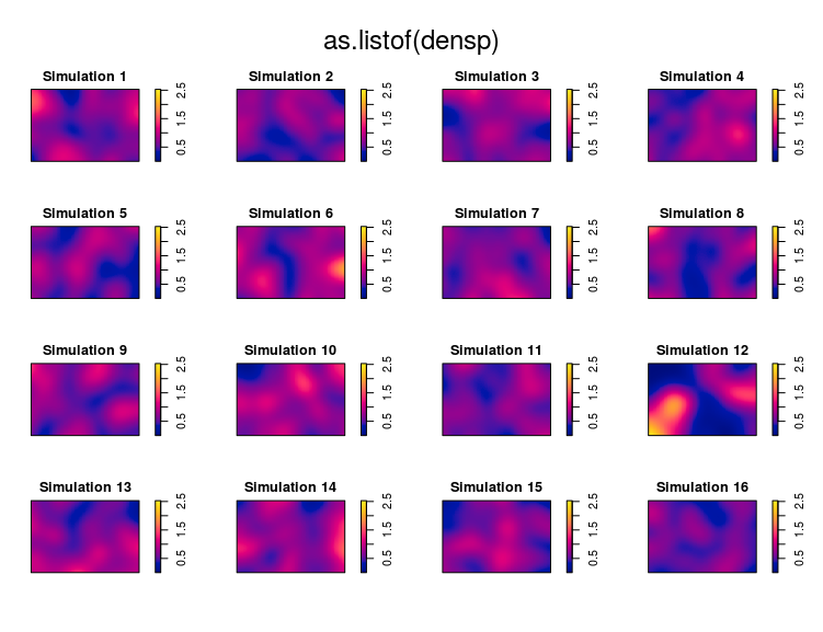
If you can find the real dataset within the simulated ones then there is evidence that an inhomogeneous process generated the data. You have to use special functions in that case.
The second approach consist in dividing the window in quadrats and to count the number of points per quadrat. Using a chi-square test one can infer if the point pattern was homogeneous (p > 0.05) or inhomogeneous (p < 0.05):
quadrat.test(ant_pp)
The output tell us that the null hypothesis of the point pattern being generated by complete spatial random process is rejected, we have some evidence that the point pattern is inhomogeneous or non-stationary. There is one issue with the quadrat approach: one need to define the size of the quadrats, the default value is to create 25 quadrats, but I find it hard to come up with reasonable explanation for using that or other values.
Bottom-line is: it seems that our ant point pattern is inhomogeneous, we’ll need to use specific methods.
A commonly used exploratory analysis of point pattern is the K-Ripley function. The idea is to count the number of neighboring points within increasing distance from a focal point. Imagine drawing circles with a focal point as the center and counting the number of other points that are within this circle, now do this while increasing the radius of the circles and for each point. If the point pattern follow Complete Spatial Randomness (CSR) then there is a known relationship between this count number (K) and the distance considered (r). In R the code to achieve this on the ant nests point pattern is:
ee_iso <- envelope(ant_pp,fun=Kest,
                   funargs=list(correction="border"),global=TRUE)
plot(ee_iso)
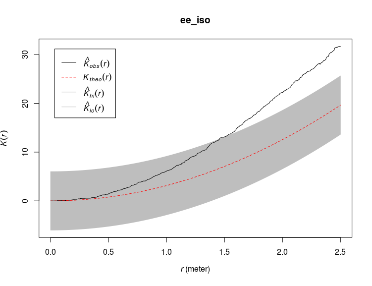
Here I derived an envelope around the expected ($K_{theo}(r)$) K values from simulated random point process. I applied a border correction, see ?Kest for more informations on the different corrections available. I also use a global estimator for the envelope (global=TRUE) to ensure constant envelope width at any distance (see this book chapter). The observed curve ($K_{obs}(r)$) fall above the expected one which means that there are more points than expected within certain distance of one another, or in other words the points are more clustered than expected. If the observed curve would fall below the expected one then the points are more dispersed than expected. The function Kest assume an homogeneous or stationary intensity function, this means that by using Kest we assume that the point pattern was generated by one homogeneous intensity function characterized by the average intensity of our point pattern (intensity(ant_pp)). However as we saw before, we have some evidence that the point pattern of the ant nests is not homogeneous, we should therefore take this into account by using a modified version of the Ripley’s K function implemented in the Kinhom function:
ee_inhom <- envelope(ant_pp,fun=Kinhom,global = TRUE)
plot(ee_inhom)
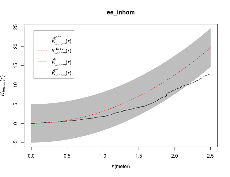
This time the observed curve is below the expected one for large distances, implying more dispersion in the nests than expected under CSR taking into account the inhomogeneity of the point pattern. The way Kinhom works is by deriving an intensity estimate from the data (similar to density.ppp) and by weighting each point based on their estimated intensity. Note that the confidence band derived on these two graphs are not confidence intervals, see ?envelope for an explanation, alternatively you can use ?varblock or ?lohboot to derive bootstrapped confidence intervals of the expected K values under CSR. There are many more methods and functions available to explore point pattern, I choose Ripley’s K here as it is the most commonly used function.
What do we take from this exploratory analysis:
-
The Ant nests show inhomogeneous pattern
-
There is some evidence that at large distances ant nests are more spaced than expected from the estimated intensity function.
Now we can move to the next step and model our point pattern.
Building Point Pattern Models
spatstat provides many functions and methods for fitting models to point pattern data allowing testing specific hypothesis on the drivers of the point pattern. With our ant nest data example we could be interested to see, for instance, if nest density depend on the density of particular plant species. Point pattern models try to predict variation in the intensity over the area, the response variable in these models are not the point themselves but rather the intensity function that generated the data. The first function we’ll see is ppm:
#fit an intercept-only poisson point process model
m0 <- ppm(ant_pp ~ 1)
m0


Stationary Poisson process
Intensity: 0.7
 Estimate S.E. CI95.lo CI95.hi Ztest Zval
log(lambda) -0.3566749 0.09759001 -0.5479478 -0.165402 *** -3.654831
This is the simplest model one can fit, the model basically tells us that the intensity (the density of ant nests) is $e^{-0.36} = 0.70$ throughout the observed area. Just try to run plot(predict(m0)) to see what this model implies. Note that the exponential is there because these models are log-linear by default. Now we can use the coordinates as predictor in a model:
m1 <- ppm(ant_pp ~ polynom(x,y,2))
m1
plot(m1,se=FALSE,how="image")
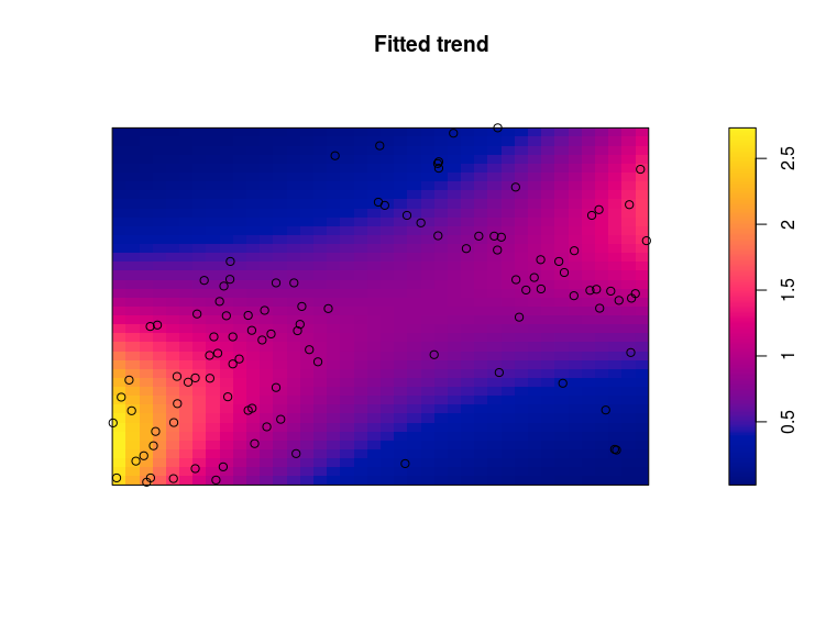
This model fitted the following relation: $log(\lambda) = x+y+x^2+y^2+x:y$, so basically a quadratic relation for each coordinate axis plus an interaction term. The plot show the predicted intensity (the $\lambda$) from the model with the observed ant nests added to these. There are quite some handy transformation available for specifying formulas in ppm models (see Table 9.1 page 12 in this book chapter). As for every model an important next step here is model validation, several functions are available: diagnose.ppm plot many important model diagnostic:
diagnose.ppm(m1,which = "smooth")
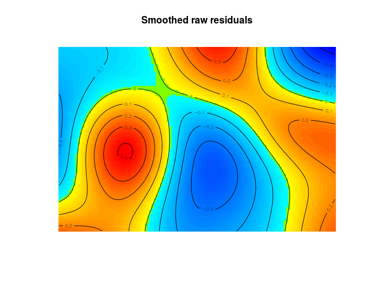
By default diagnose.ppm produce four plots, here I only asked for a plot of the smoothed residuals so that we can identify areas where the model badly fits the observed point patterns. There are some areas with poor fit from this model. One can also use the fitted intensity in the Kinhom function to see if the observed point pattern is more or less clustered than expected from the model fit:
eem <- envelope(ant_pp,Kinhom,funargs = list(lambda=m1),
                 global=TRUE)
plot(eem)
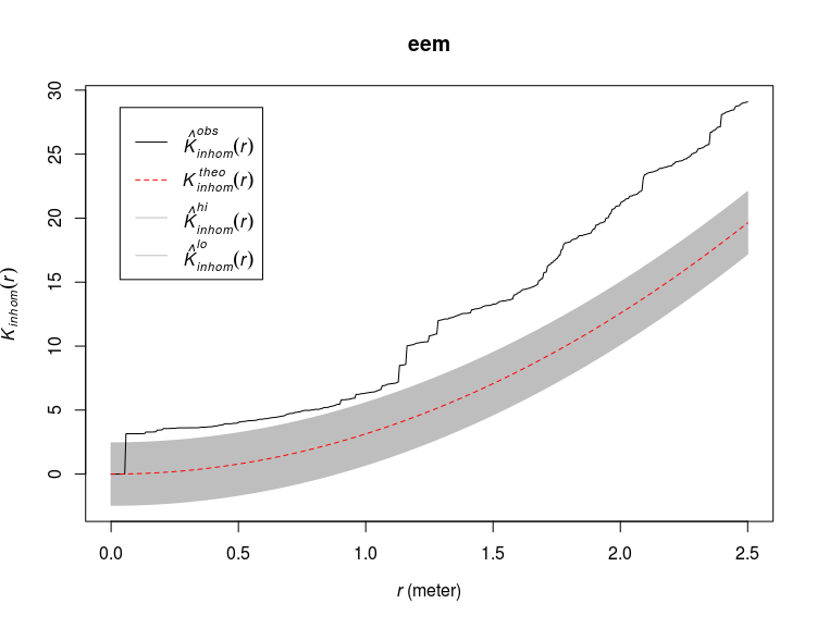
Here we see that the observed point pattern is more clustered than expected based on the model. One solution would be to use clustered poisson point process models (function kppm):
m2 <- kppm(ant_pp ~ polynom(x,y,2))
plot(m2,what="statistic",pause=FALSE)
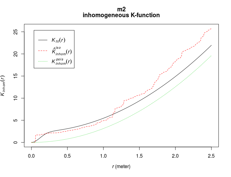
The dotted green line show the expected K values based on the predictor in the models, the solid black line adds to the predictor the fitted clustering process (in this case a Thomas process, see ?kppm for other options) and the dashed red line are the (iso-corrected) observed K values. Adding a clustering process into the model somehow improved it but it is still not perfect. Simulating point patterns from the fitted model is also easy, we will use it here to see if there are marked differences between the observed and the simulated point pattern:
#a random position
pos <- sample(1,1:16)
#simulated 15 point pattern from the model
sims <- simulate(m2,nsim = 15)
#put the observed point pattern in the random position
tmp <- sims[[pos]]
sims[[pos]] <- ant_pp
sims[[16]] <- tmp
names(sims)[16] <- "Simulation 16"
#compute density estimates
densp <- density(sims)
#plot, can you detect which one was the observed dataset?
par(mfrow=c(4,4),mar=c(0,0,4,4))
plot(as.listof(densp),zlim=range(unlist(lapply(densp,range))))
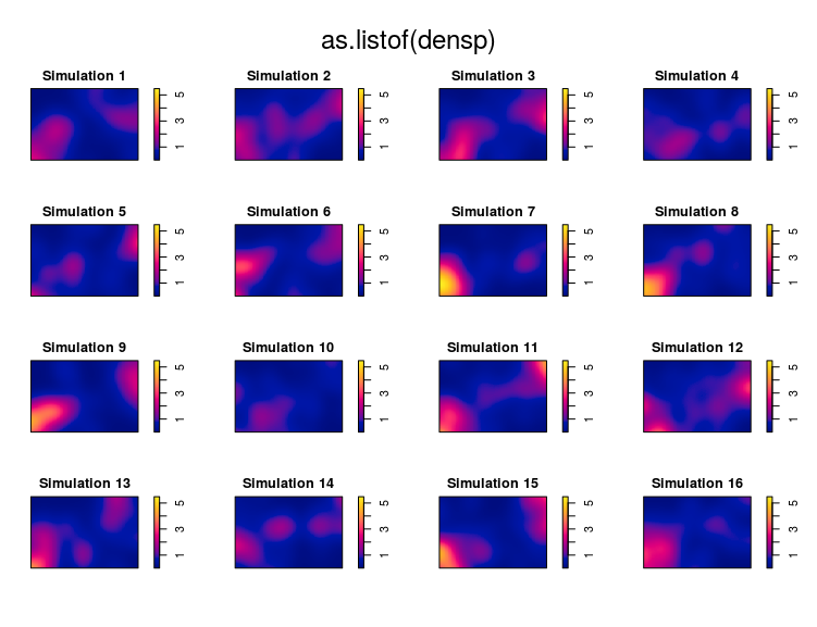
I cannot really recognize the observed pattern, therefore this model is rather good.
The predictors of the point patterns could also be pixel image (or “im”) objects, in our example we will use as predictors the densities of one plant species: Senecio jacobaea:
m3 <- kppm(ant_pp ~ Senecio_jacobaea,data=dens_all)
#let's look at the expected K values
plot(m3,what="statistic",pause=FALSE)
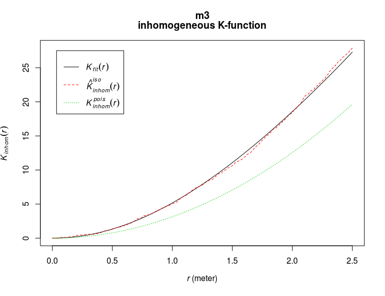
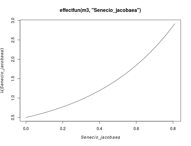
This model is clearly better than the previous one. The effect of the covariates can be plotted using for instance the effectfun function:
#looking at the effect of Senecio jacobaea
plot(effectfun(m3,"Senecio_jacobaea"))
But one can draw way cooler maps in spatstat:
#draw a cool perspective map
pp <- predict(m3)
M<-persp(dens_all$Senecio_jacobaea,colin=pp,box=FALSE,
         visible=TRUE,apron = TRUE,theta=55,phi=25,
         expand=6,main="Senecio jacobaea density")
perspPoints(ant_pp,Z=dens_all$Senecio_jacobaea,M=M,pch=20)
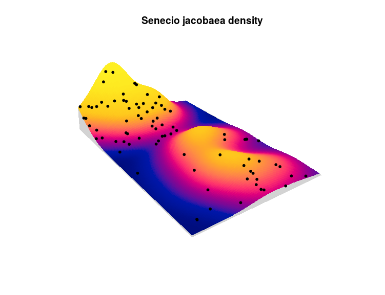
The height of the plot represent the density of Senecio jacobaea shoots, the color the fitted intensity for the ant nests and the points represent the actual observed ant nests. There still some areas in this plot which do not correspond to the observed pattern, one could expand this model by using other clustering process, adding the x/y coordinates to the model, trying different plant species, adding other covariates like temperature, elevation or soil conditions …
Conclusion
The spatstat package contains tons of ways to handle, explore and fit models to point pattern data. This introduction is rather lengthy but I just scratched the surface of all the possibilities offered by the package. I hope to have covered the most important aspects to get you started with point pattern analysis, if you want to know more the new spatstat book is a great reference.
PS: You can find all this post in rpubs.
Leave a Comment